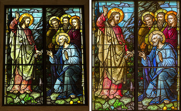
Over the weekend I photographed the stained glass windows in a little chapel, and later began thinking it might make an interesting blog post. It is not always easy to recreate the original look of stained glass windows. First of all, they often record with too much contrast. Second, it is almost impossible to accurately record the color because it is so dependent upon the light source illuminating it from behind. Plus, determining the correct exposure is complicated because the meter will try to set an exposure to include the interior of the building, which is much to dark by contrast.
I start off by recording RAW images and bracketing the exposures with the camera on a tripod. The tripod insures that the images will be in register in case I have to overlap them later on to equalize the light. In this case, I did not have to do that.
I include more area than I need so that I can crop and readjust the perspective later in Photoshop. It is important to start with an image (or images) with enough detail to make corrections. This is where shooting RAW with its 16 bit depth comes into play. A good, modern digital camera is going to provide plenty of detail to work with in post-processing. It is very important not to allow the highlight to blow out. That will result in no detail with which to work later.
In Bridge I use the "Highlight" slider to bring down the highlights. Next I adjust the "Shadows" slider to brighten the dark areas and open up their color. Using these two sliders opposite to each other will bring down the highlights and put detail in the shadows, but also tend to flatten the image. To correct this I increased the "Clarity" slider. I use this instead of "Contrast" to punch up a scene by increasing the contrast. In addition, I also increased the "Lights" on the contrast curve.
Adjusting the color is a bit tricky because a gray card wouldn't work in this situation. I looked for an area of the stained glass that was supposed to be white and used that to click on in Bridge to set the color balance. In the image above I used the white pages of the book.
The color often mutes a bit so I bring back the vibrancy by moving the image in the LAB color space, and use curves to enhance the color channels.
All photos were taken with a Leica M (240) and Leica-R 80-200mm zoom lens.


Tidak ada komentar:
Posting Komentar